

Designing Of A Payment App
Redesigning Digital Payment app — Google Pay UX/UI case study
![]()
Let's talk about UPI apps lineup in general. With the pandemic in place, people and businesses have started to lean more towards digital wallet apps rather than carrying around hard cash. So the reliance on UPI apps has increased significantly. So, with increase in the usage and popularity of these apps, comes the necessity of enhancing its user experience!
Market
- Widely used in Tier 1, 2, and 3 places. Fewer in rural area
- Popular amongst millennials
- Businesses include Shops and departmental stores.
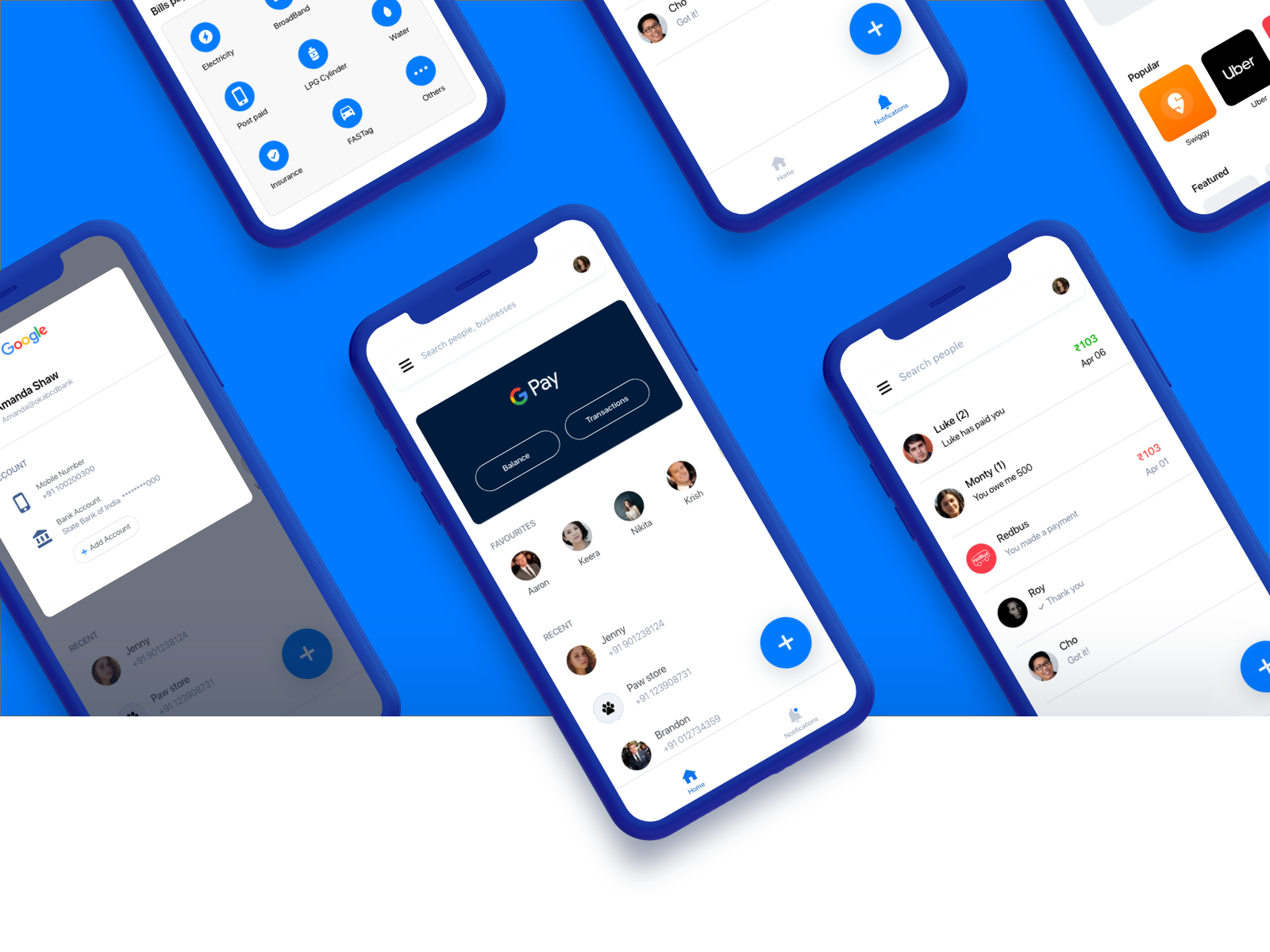
Let's talk about Google Pay
What are the things special in Google Pay
- Minimal, neat and brief to the point
- Blue — People love that color
- Users love Rewards and Coupons
User persona
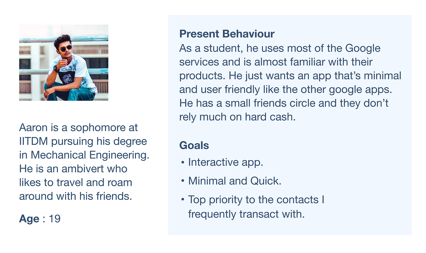
Empathise with the User
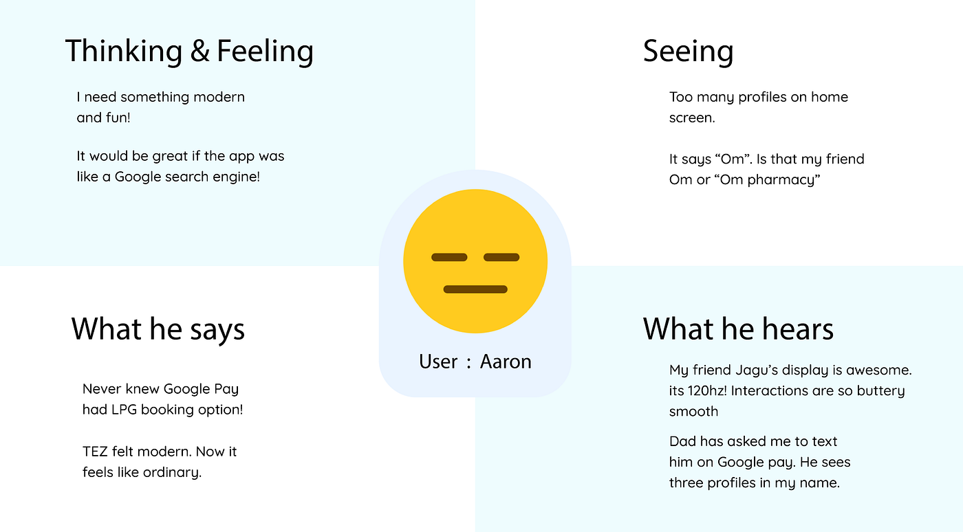
Pain points
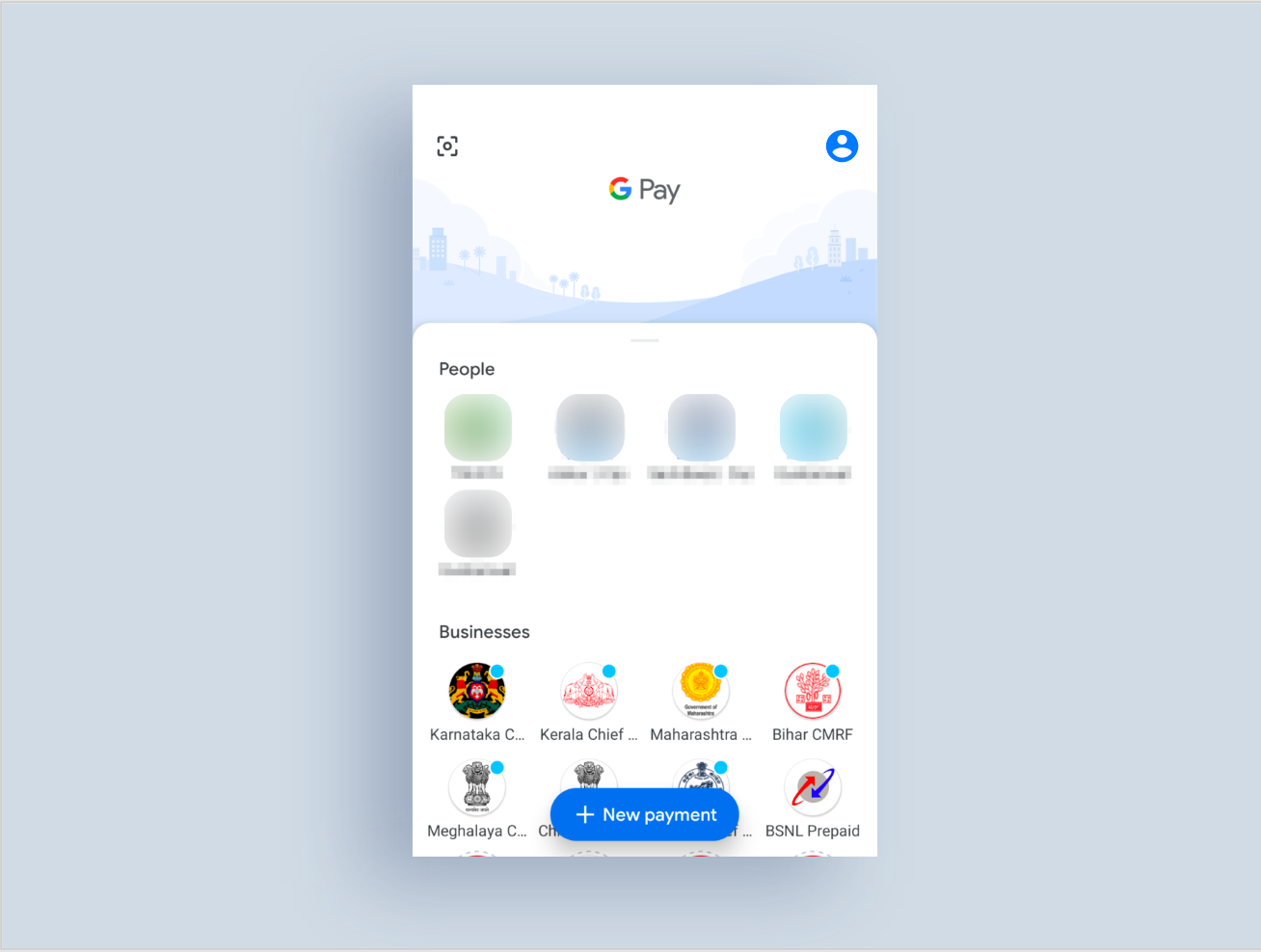
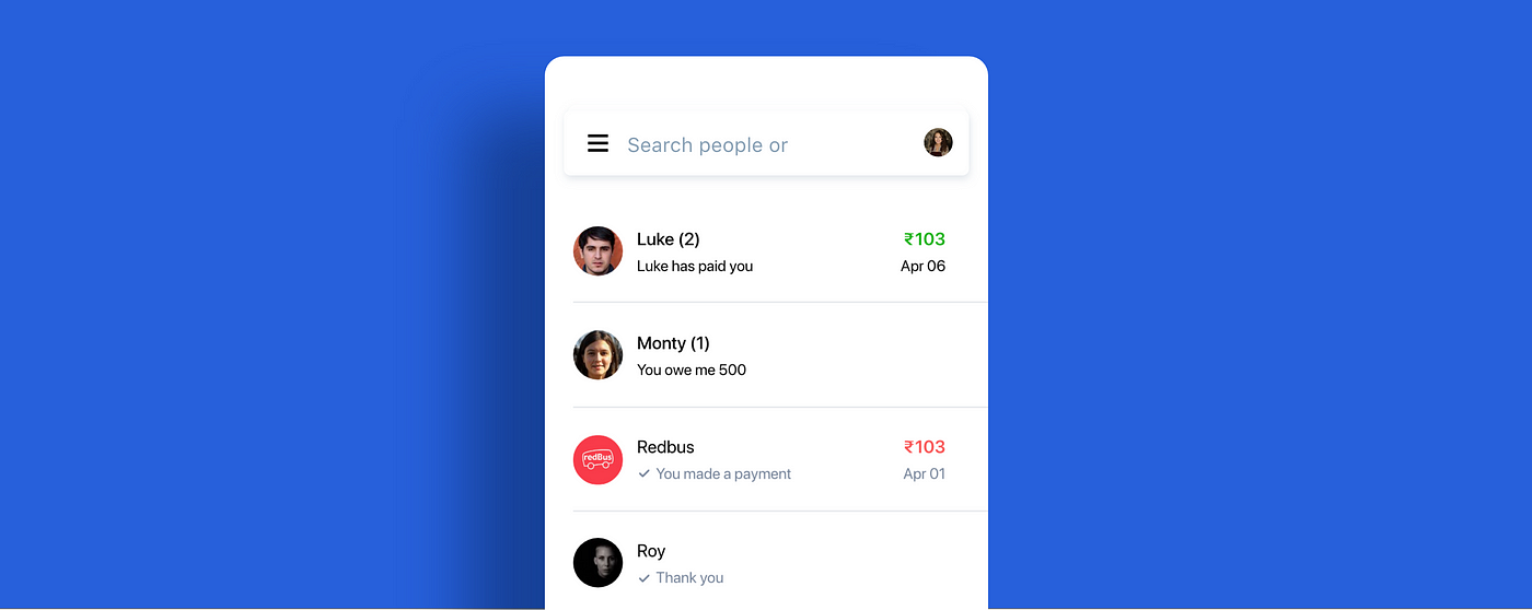
- Lack of separate screen for notifications and chats.
- Cluttered contact listing in home screen. Sometimes, the users have contacts of same names so its confusing.
- Lack of "Favourite list" — contacts that a user frequently transacts to.
- People don't know that they can search for services and app shortcuts like Swiggy, Uber in search. They think the search is only for names and phone number.
- Bill Payment options — Users are unaware of the Bill payment options like Cylinder booking, Electricity Bill payment, and others that are present in the app. Lack of feature awareness.
- Coming from TEZ mode to normal tap interaction is kind of a down grade. ( Not a deal-breaker but still !) Lack of Interactive design.
Solution
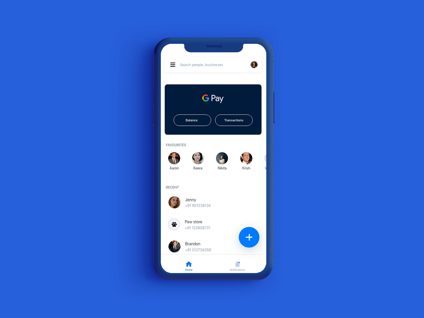
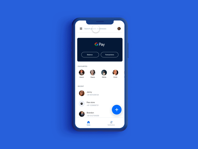
- Home screen simplified. Showcasing the contacts whom I transacted recently, in the order of transaction. Listing the contacts in the vertical column to reduce confusion.
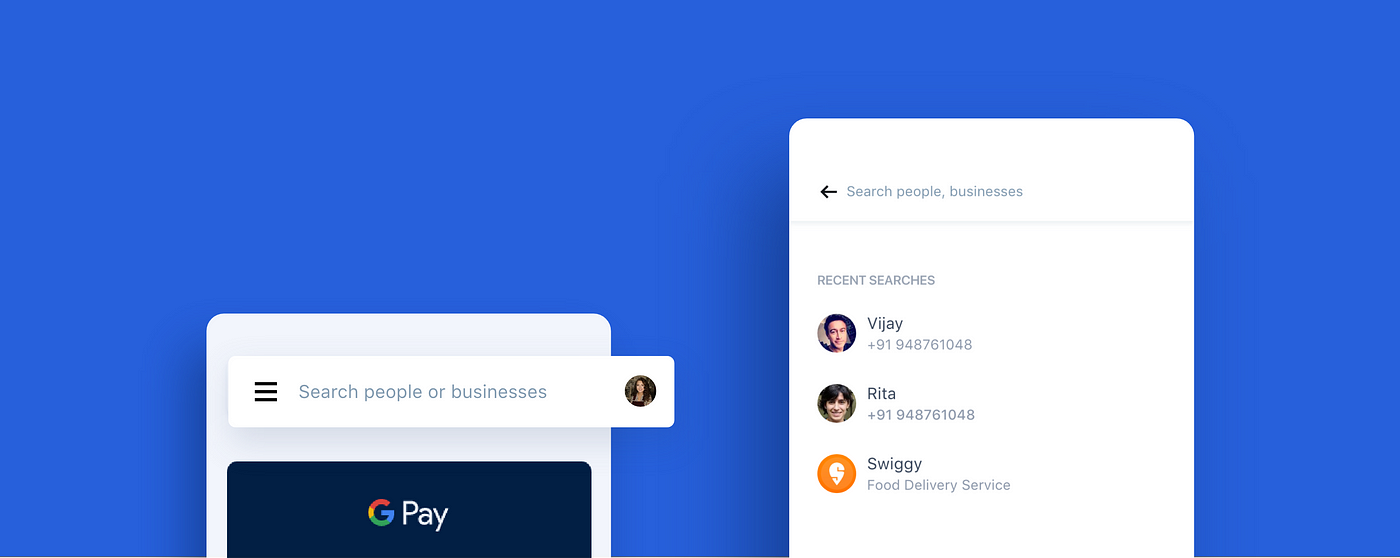
- Providing Intuitive Search at Home screen. In the usability testing session, the facilitator observed that users felt it easy to just search the contacts's name rather than searching for him/her in the 'recents'.
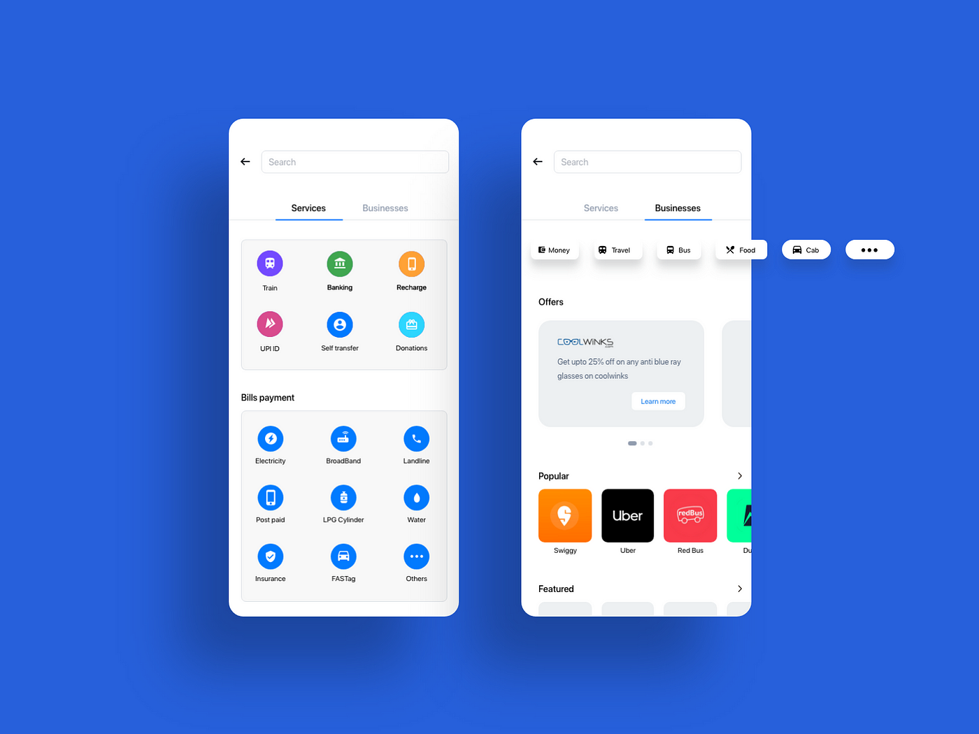
- Services & Businesses simplified. Easing the discoverability of the services & businesses in the app, and using chips to filter businesses.
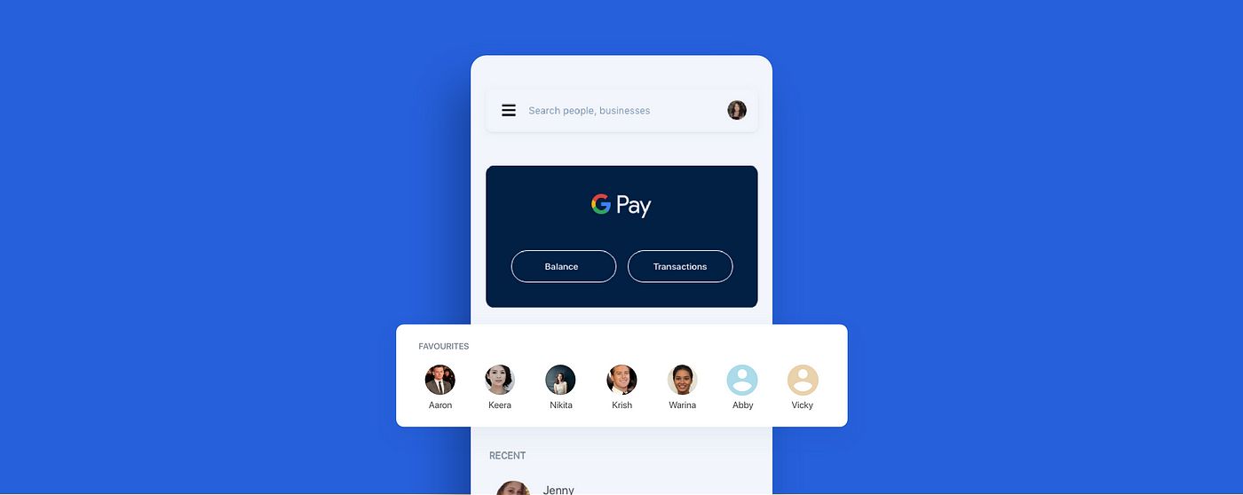
- Pin your people. First priority to your favourites! This idea suits the users who have monthly bills, fund transfer to particular person or contact.
- Separate Bottom navigation for notifications. Prioritising payment requests, message to keep track of our conversations and payments.
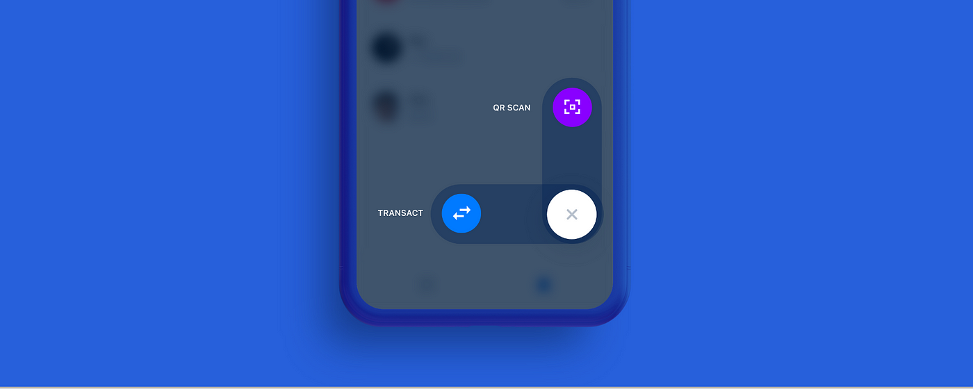
- Dash of bubble like interaction. This interaction is designed in way that supports the conceptual model of bubble like swipe, along with feedback of its swiping mechanism.
Prototype
Conclusion
While redesigning this app, I had to iterate the design a dozen times!. But as designers, the main part is to make the right decision in the end. This tends to get even more difficult when you are working on something that is used by millions. There is 'enhancing the user experience', and there is 'optimising and designing the app to make use of the developing technology'.
Let me know what you think about this!
Thank you for all the appreciations. Really means a lot to me. Do comment out your suggestions and opinions!
Designing Of A Payment App
Source: https://medium.muz.li/redesigning-digital-payment-app-google-pay-ux-ui-case-study-c7d761d226d1
Posted by: brownwifigh.blogspot.com
0 Response to "Designing Of A Payment App"
Post a Comment